Johnson’s Baby Global Redesign
Reimagined the Johnson’s Baby global packaging system to meet modern consumer expectations for simplicity and transparency while improving brand consistency, reducing production complexity, and enabling cost efficiencies across the portfolio.
Role: Global Designer & Regional Design Management
Scope: Global portfolio redesign across 100+ SKUs
Focus: Brand modernization, global system development, color strategy, illustration system
Team: 2-4 Graphic Designers, Industrial Design, Packaging Engineering, R&D, Marketing, Consumer Business Insights (Global & Regional)
Design Direction: Jennifer Dahl
-
Modernize a 130-year-old global brand while responding to evolving consumer expectations for simpler ingredients, clearer communication, and easier-to-navigate packaging.
Over time, the Johnson’s Baby portfolio had grown inconsistent across regions. Identical products varied visually around the world, structural colors were fragmented, and production complexity had increased significantly. The redesign required a unified global system that could scale across 100+ products, multiple languages, and varying regional regulations—while preserving the brand’s heritage and emotional equity.
-
Led development of global color harmonization strategy and managed implementations across regions.
Designed scalable packaging templates and design intents for global design + multilingual markets
Developed and illustrated the iconography system and all toddler character illustrations
Facilitated cross-functional alignment across all regions.
Partnered with the industrial design and the packaging engineer to reduce structural complexity and dielines
-
Unified brand expression across global markets
Reduced global color complexity from 400+ colors to approximately 40
Established scalable system across 100+ SKUs
Improved shelf navigation through clear tiering architecture
Streamlined production through structural and dieline optimization


Color Strategy
The existing portfolio contained over 400 unique colors across global markets, creating unnecessary production complexity and brand inconsistency.
We conducted a comprehensive audit of the global portfolio and developed a harmonized color system that reduced the palette from 400+ colors to around 40 strategic colors. This dramatically simplified manufacturing while strengthening global brand cohesion and consumer shop-ability at shelf.
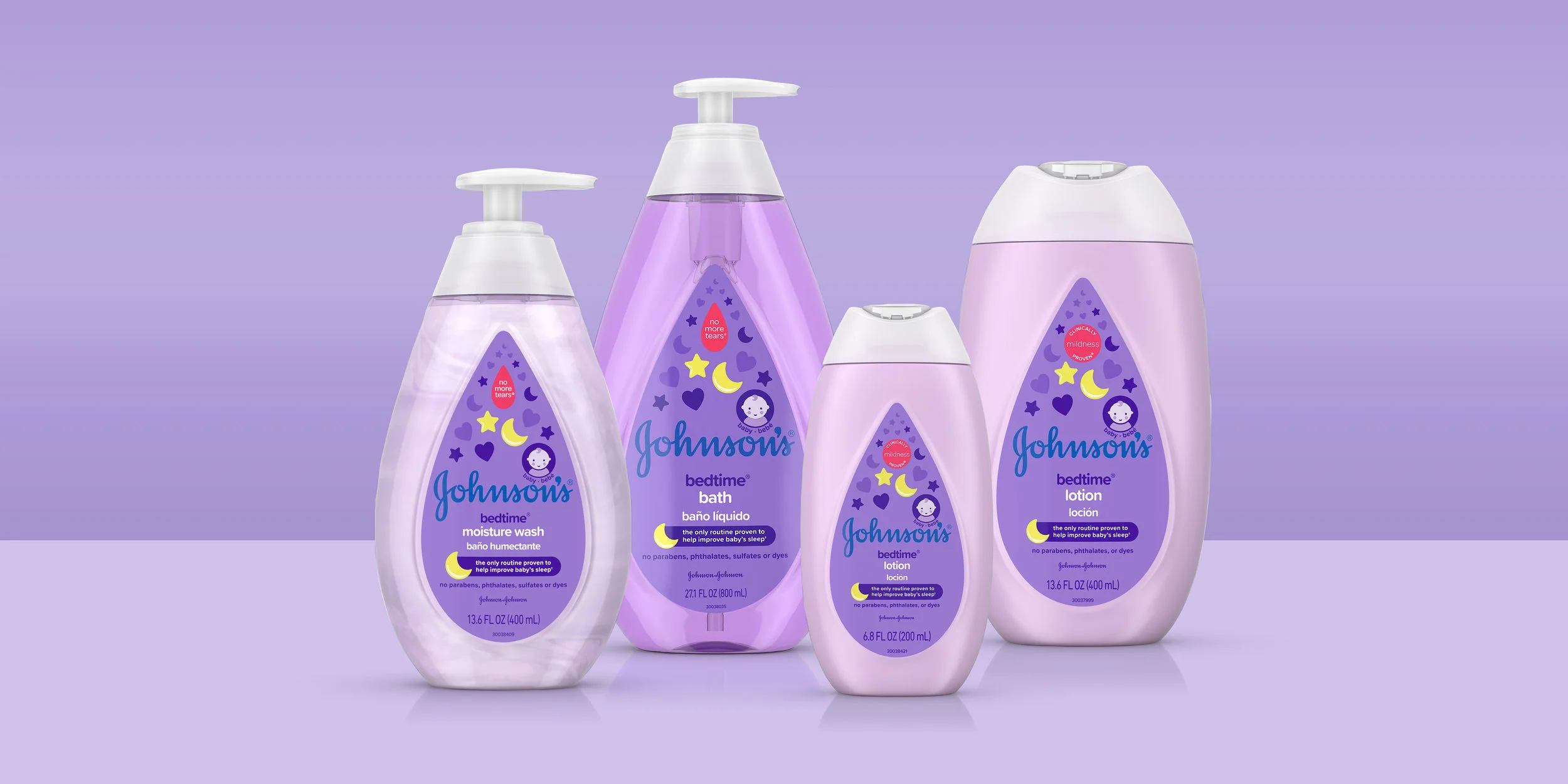
In parallel, we introduced a tiered “Ages & Stages” navigation system to improve shelf clarity. Core products remained iconic and simple, while specialized ranges were visually distinguished through structure color and pack design/illustration cues.


Structure & Dieline Simplification
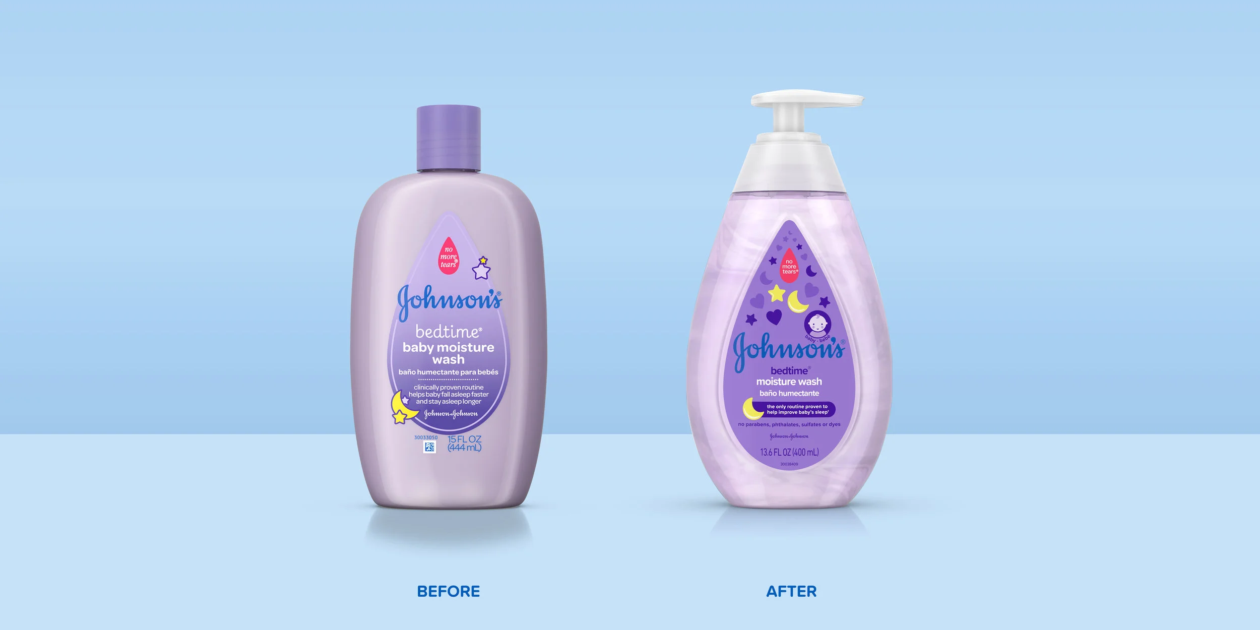
To bring consistency to the brand’s physical presence, packaging structures were redesigned to reinforce Johnson’s iconic teardrop equity.
Structural redesign reduced the number of dielines across the portfolio, streamlining production while creating a cohesive silhouette across shelves globally. The teardrop form became both a structural and graphic anchor for the brand system.


Illustration System Development
Recognizing the power in the brand equity of the “no more tears” teardrop symbol, we developed a comprehensive illustration system derived from this shape.
A heart icon—formed from two teardrops—became the visual expression of the bond between parent and baby. Our new illustration style is bold, iconic, and simple, but also soft with rounded edges reflecting a new strategy on simple formulas with fewer ingredients while remaining gentle for baby’s sensitive skin.
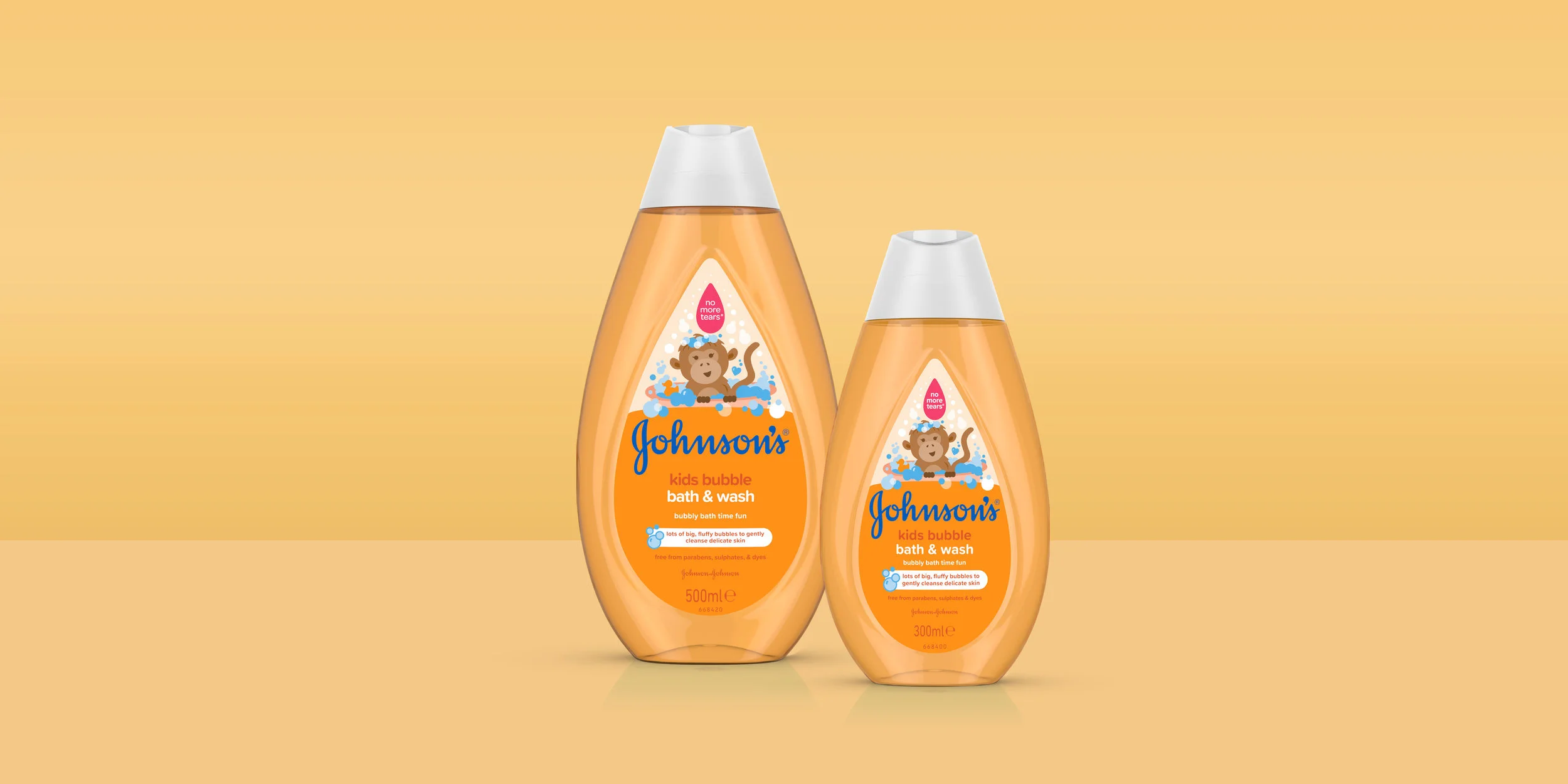
The illustrations grows and become more complex along with the ages and stages of your baby.
Classic Baby Products (used by all ages): A simple hugging heart illustrations reinforcing the mom and baby connection and the heritage of the brand.
Newborn Range: Minimal, monochromatic icons emphasizing gentleness
Active Baby (6+ months): Slightly more detailed icons with color accents
Toddler (18+ months): Playful, character-driven illustrations in brighter jewel tones
All illustrations were designed to clearly communicate product benefits and key ingredients while maintaining softness, approachability, and global scalability.


Additional technical & strategic work outlined here:
Password available upon request.